A new brand takes flight.
Branding | Strategy | Naming | Design
After purchasing the regional airline they had flown on for years, the new owners of San Juan Airlines approached me to design a logo. However, it quickly became apparent that their needs went beyond just a visual mark—they needed an entirely new brand, crafted from the ground up, that would position flying as a practical and appealing choice in the minds of the island’s travelers.

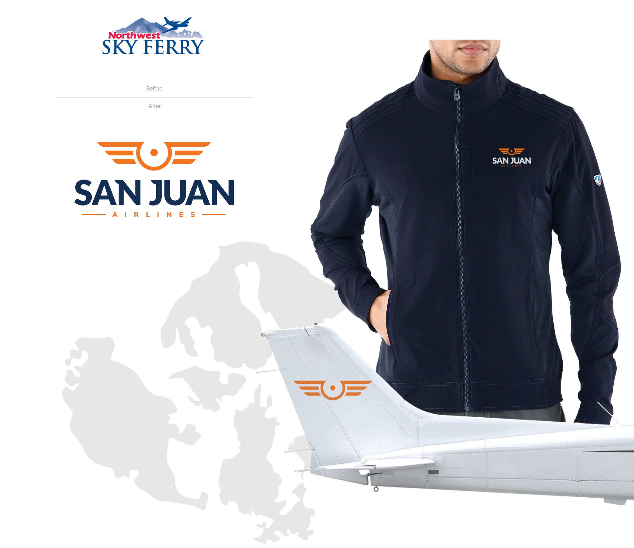
Before and after.
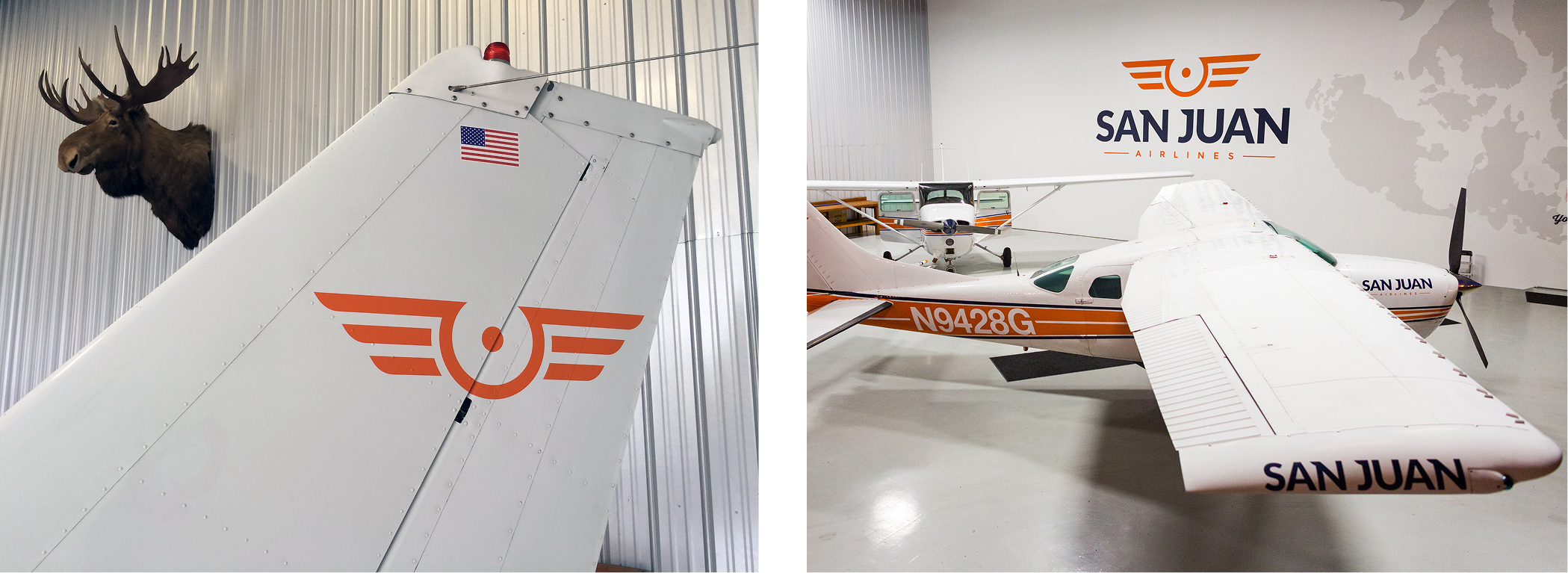
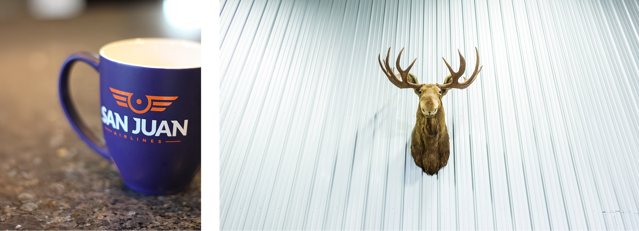
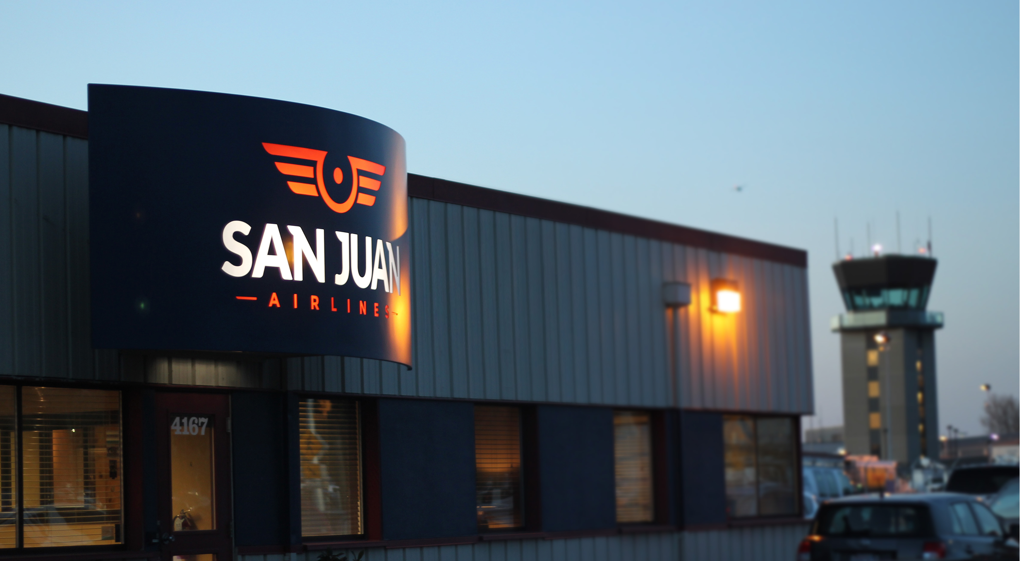
The previous brand leaned on common tropes of the region: Northwest and Mountains. Renaming the airline was our first task, quickly followed by a new brand inspired by the wings I used to get as a kid from a mid-flight visit to the cockpit. Imagine that.
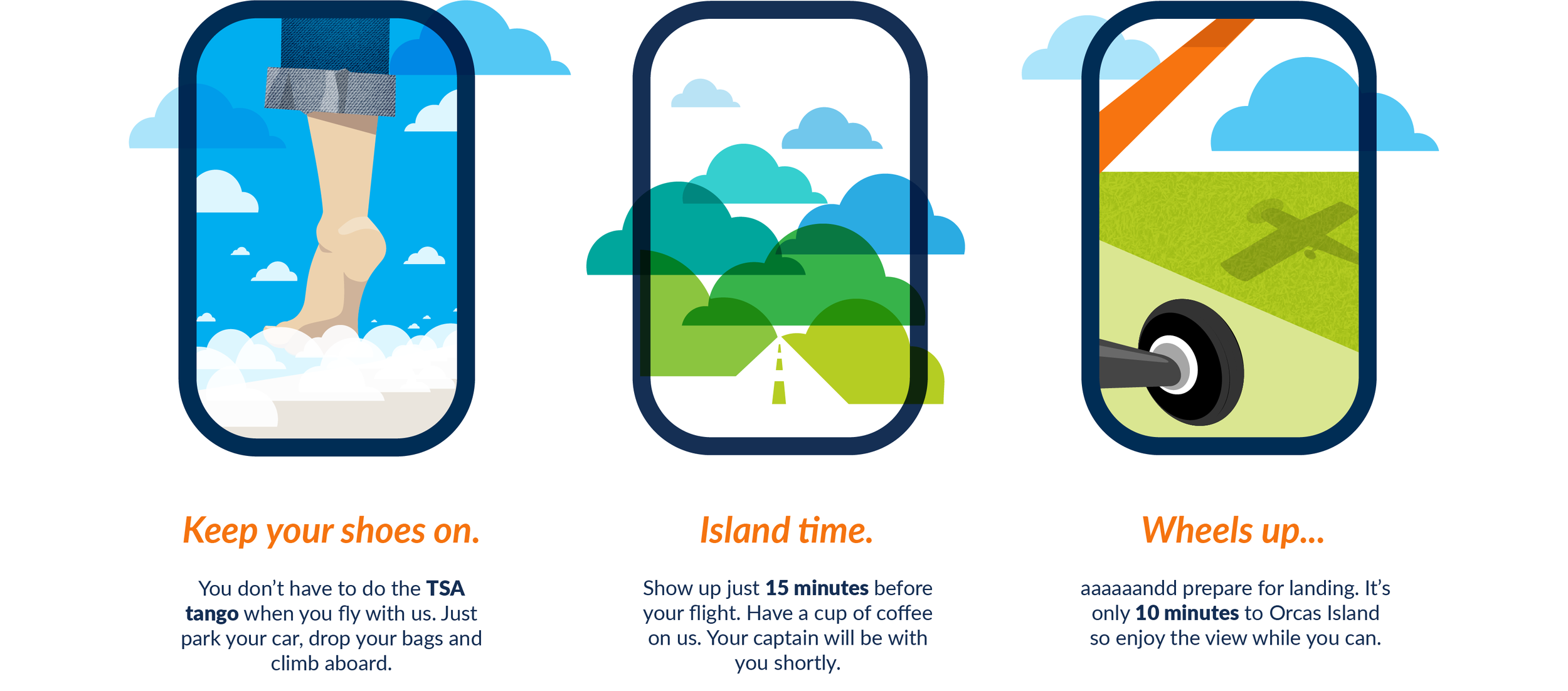
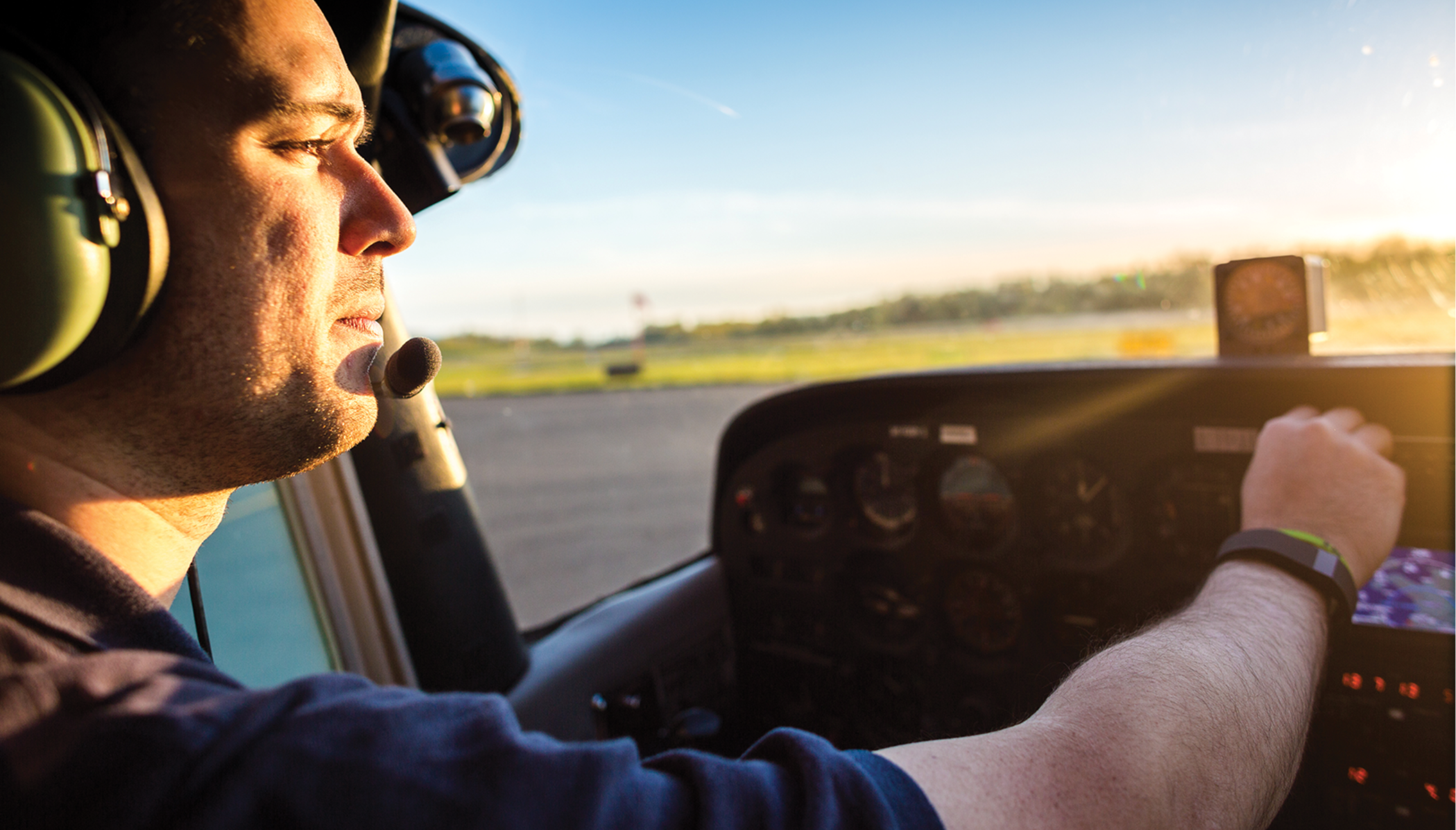
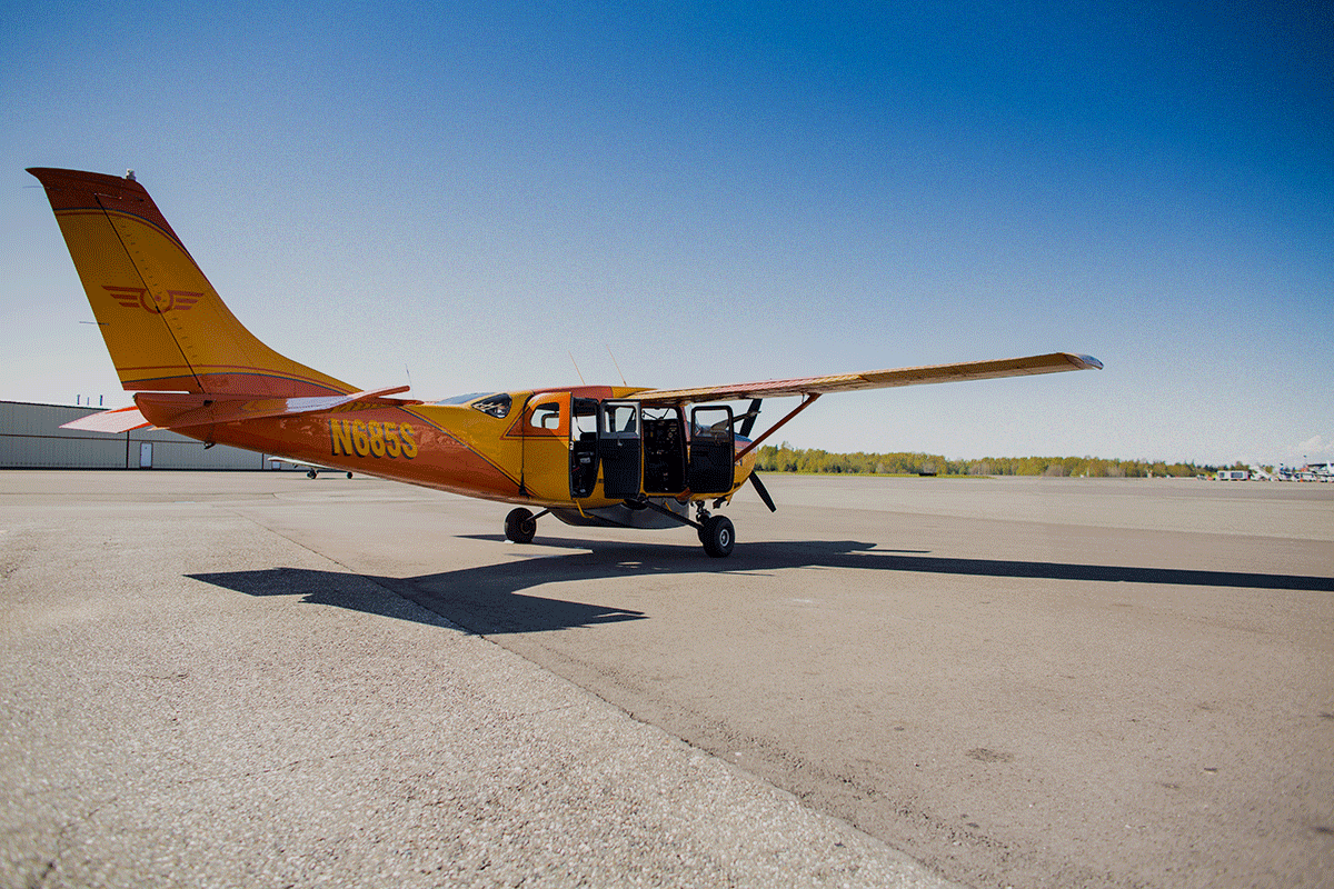
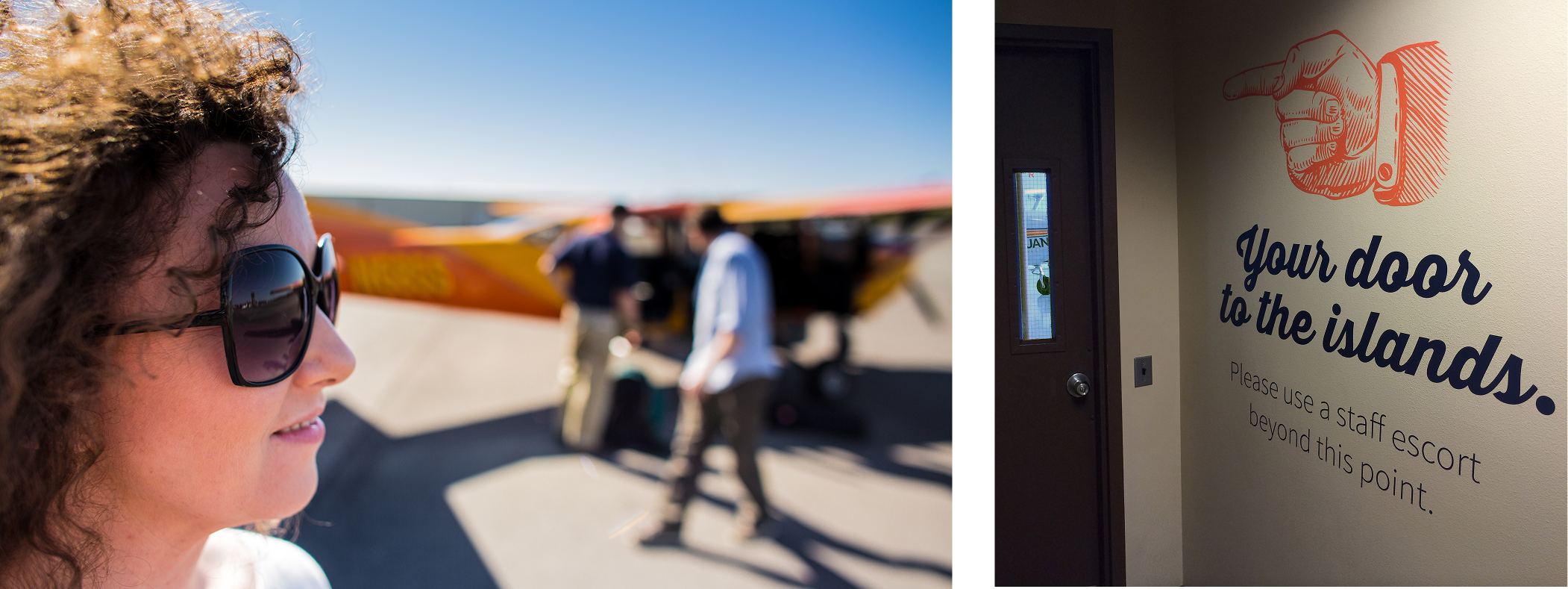
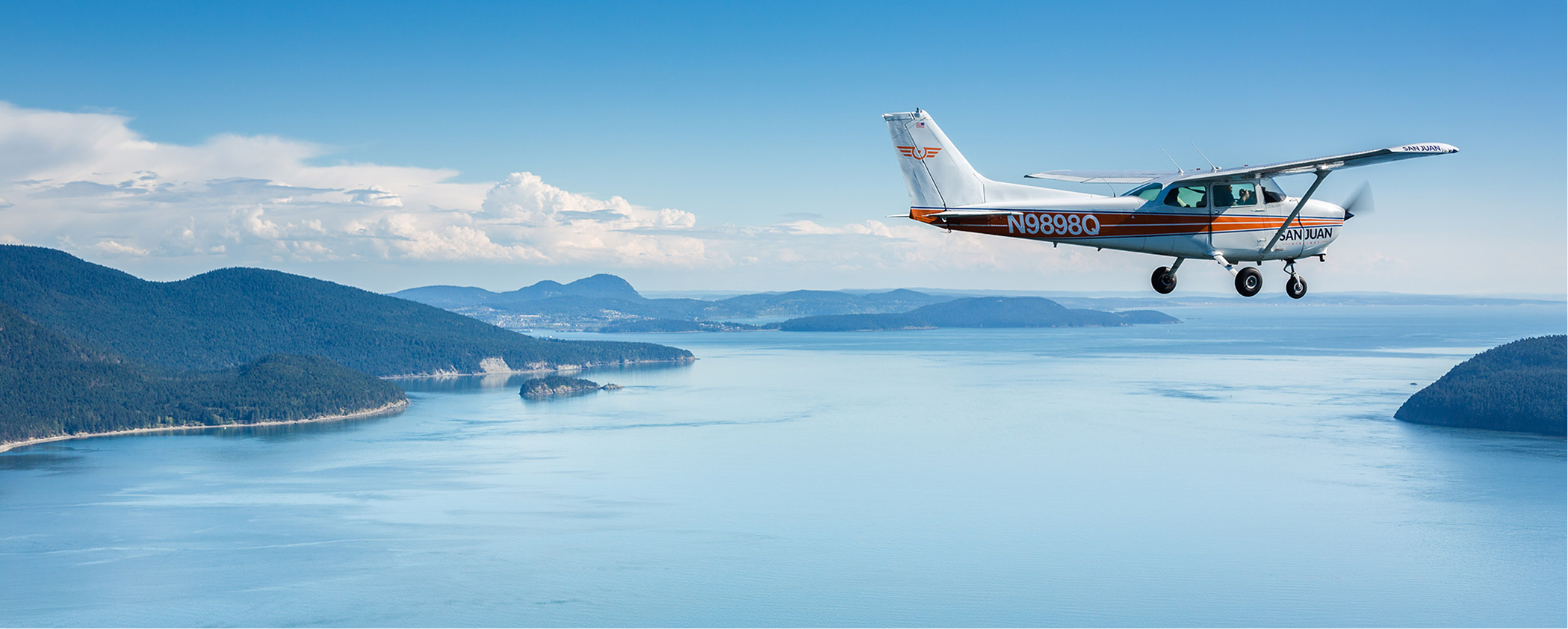
Building a photo library.
I didn’t need to ask my go-to photographer twice – we loaded up the gear and hit the skies to bank some content. It’s not hard to get a good shot when you’re cruising over the islands at sunset, but we had a plan to capture three things: the process of flying, the beauty of the islands and the character of the pilots.

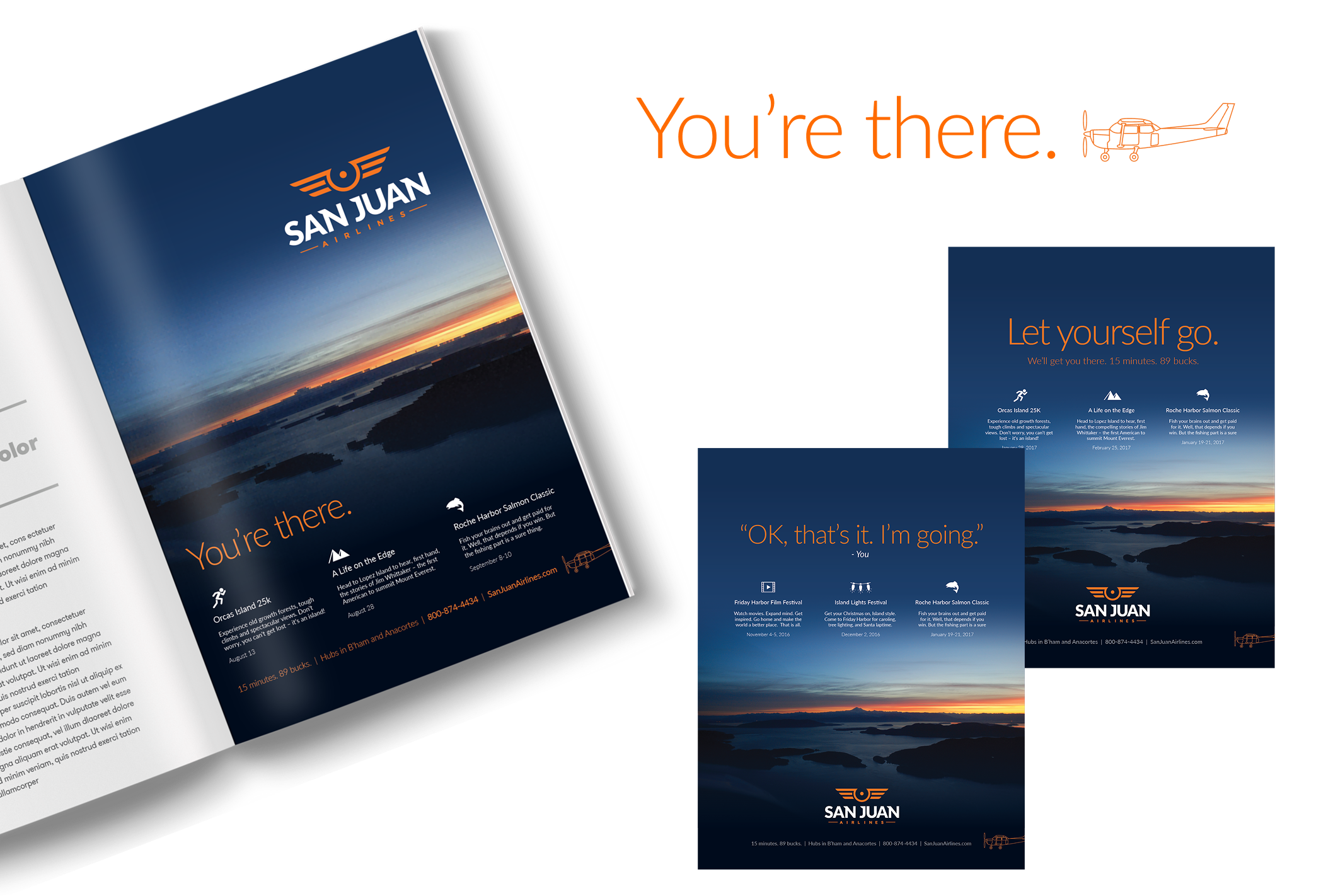
Launching a campaign.
Getting to the islands on a puddle-jumper is not only fun, it’s fast and cheap. But no one knew about it. So we spread the word with print, email, radio, and even billboards at the ferry terminals – their main competition and ripe for the picking. In addition to great deals, the ads highlighted upcoming island events, providing the perfect excuse for anyone on the fence.

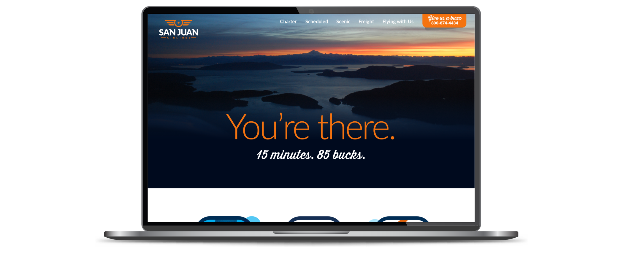
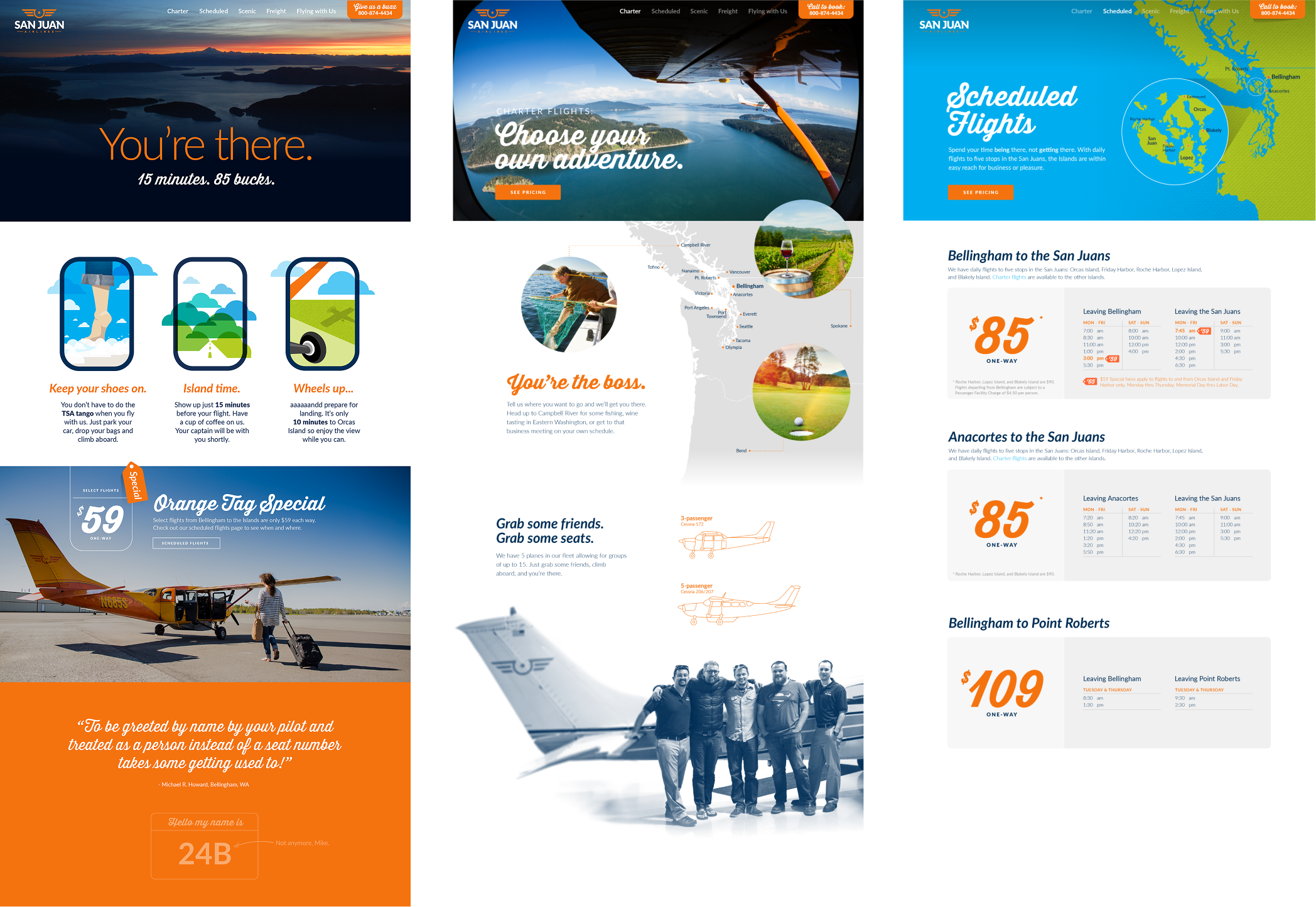
Wheels up on a new website.
The benefits of flying stood on their own, so we got out of the way and let the content win the day. Huge photos, great deals, and simple headlines let folks know the islands were within reach.