A beloved brand, reimagined.
Creative Direction | Strategy | Design
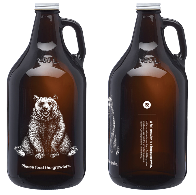
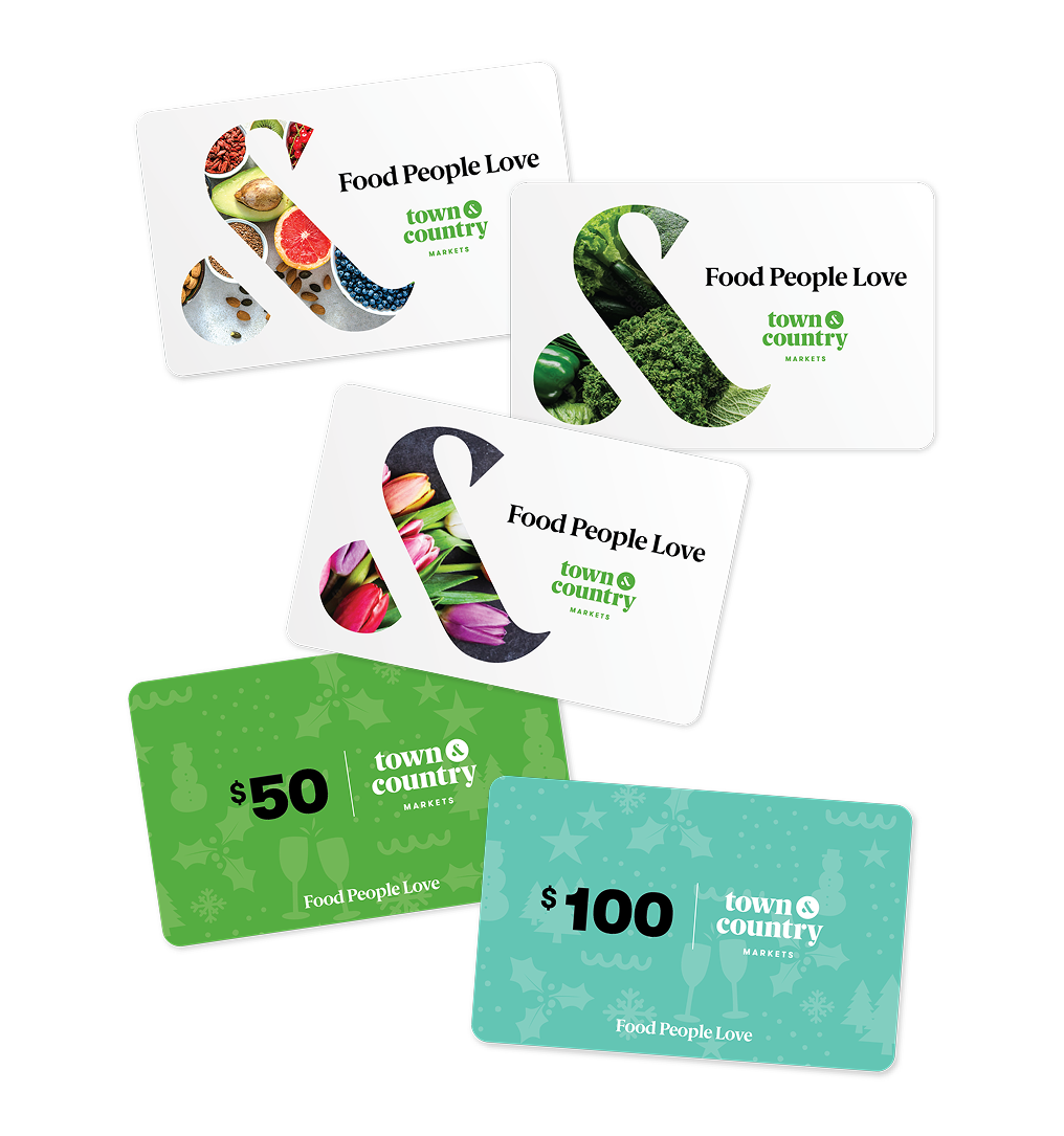
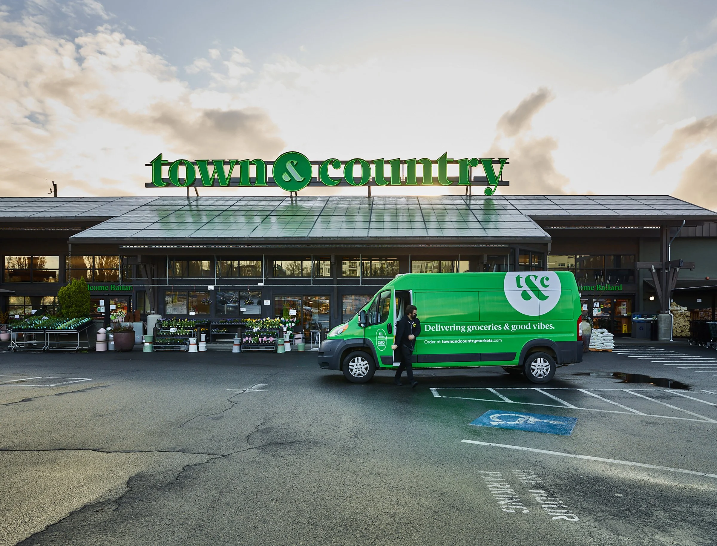
It’s a delicate thing, rebranding – rolling out a new look while honoring the old. When Town & Country Markets came to me, they had a fresh new logo that existed only in the form of Brand Guidelines. Over four years, we methodically rolled out their new brand across everything from signage, to wearables, to websites and delivery vans. We also launched a comprehensive line of private label products, targeted advertising campaigns, and even in-market restaurants.
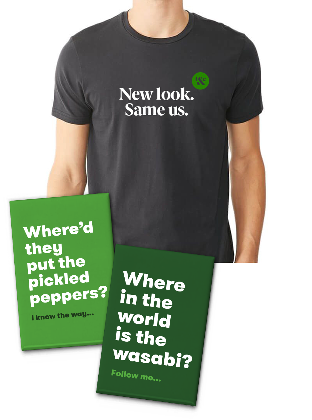
The more things change...
To kick things off, we let people know what was changing and what wasn’t. We wanted to reassure loyal customers that our owners and mission hadn’t changed, we were just bringing all the markets under one family name. Signage, shirts and buttons invited the conversation while posters hinted at what was to come.


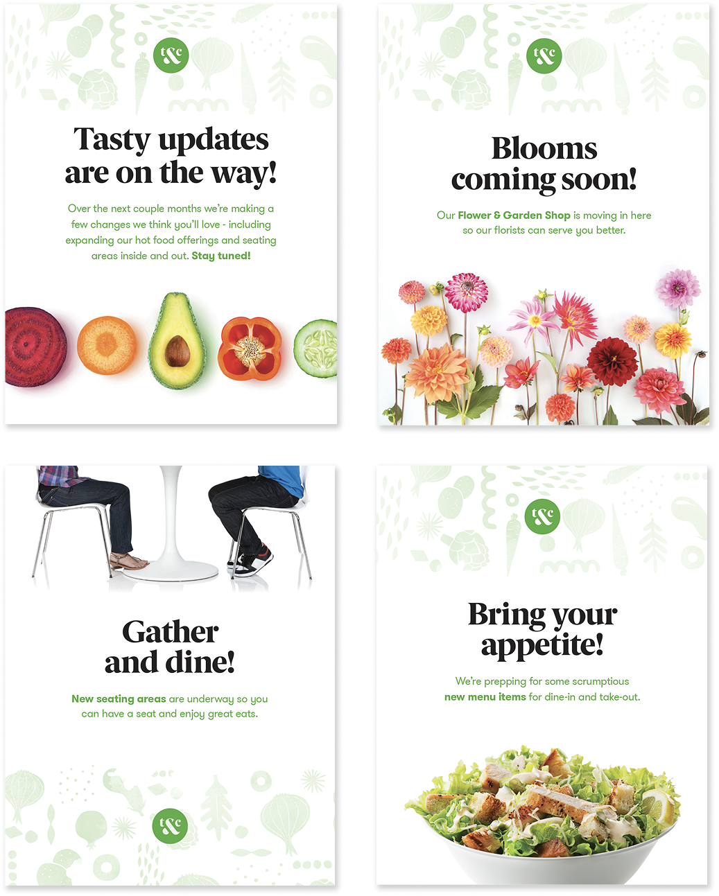

Designing the ecosystem.
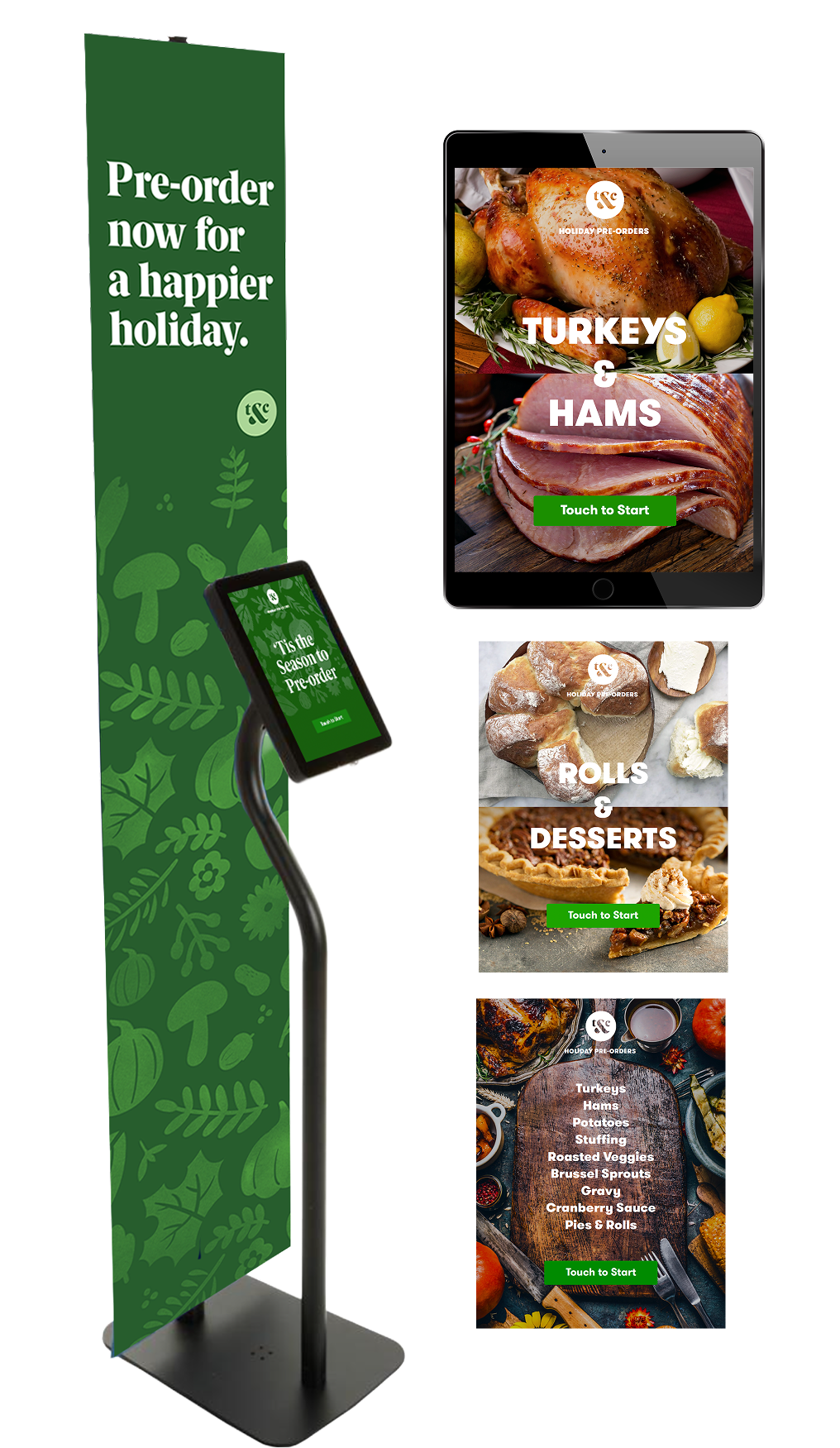
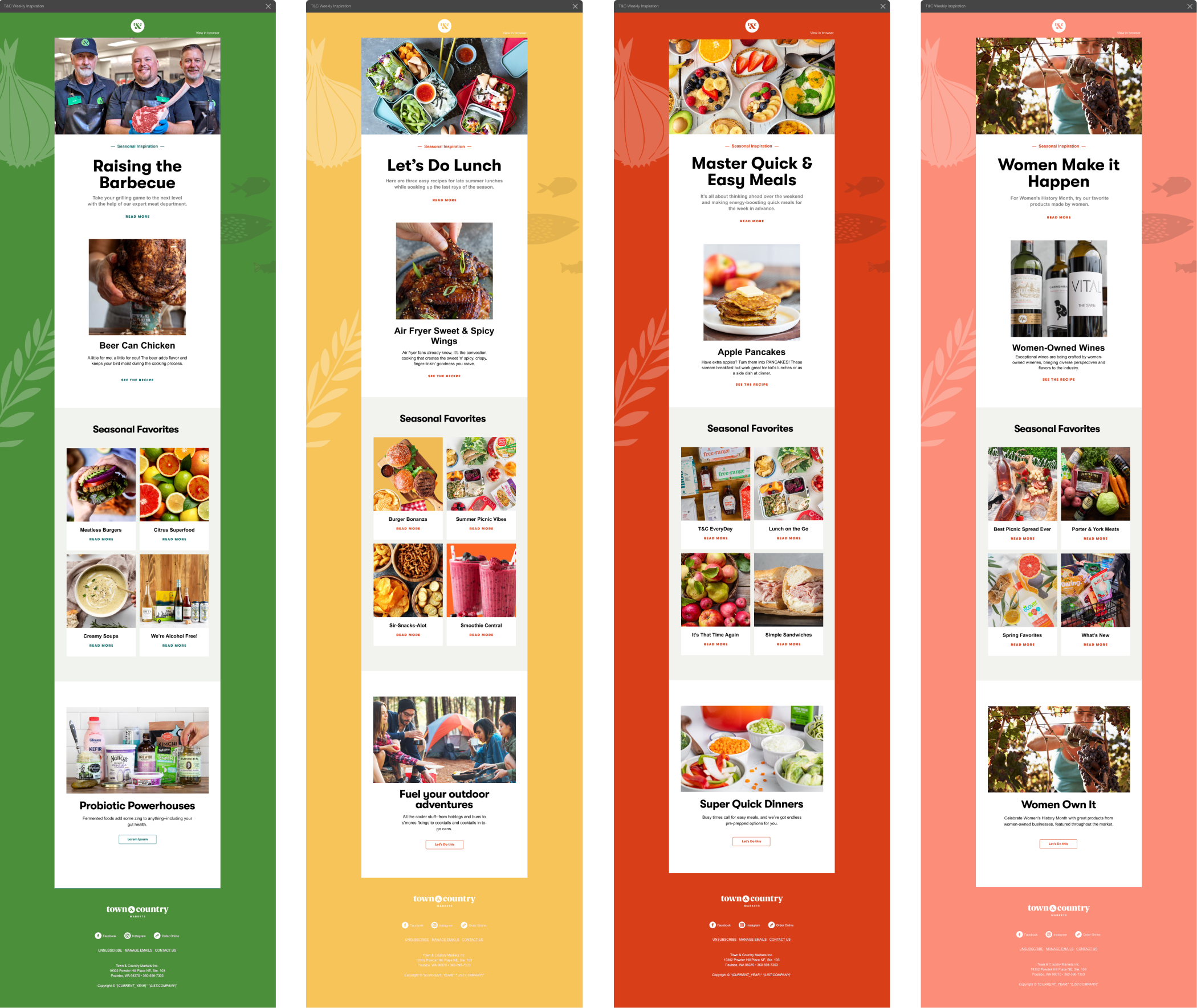
Working with copywriters, photographers, and internal stakeholders we launched cross-platform campaigns integrating web, email, social, and print. The result was a visually cohesive approach to our messaging, driving traffic and sales.

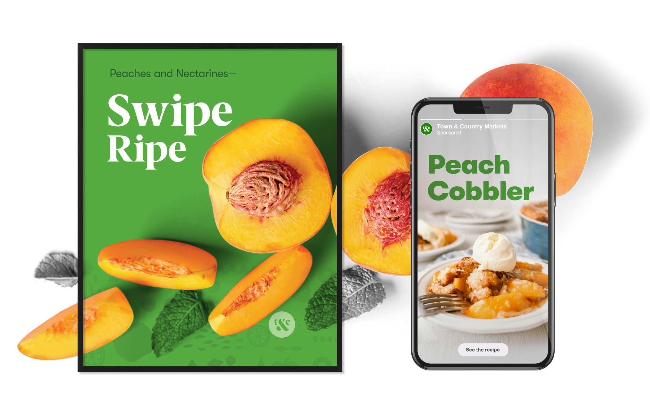
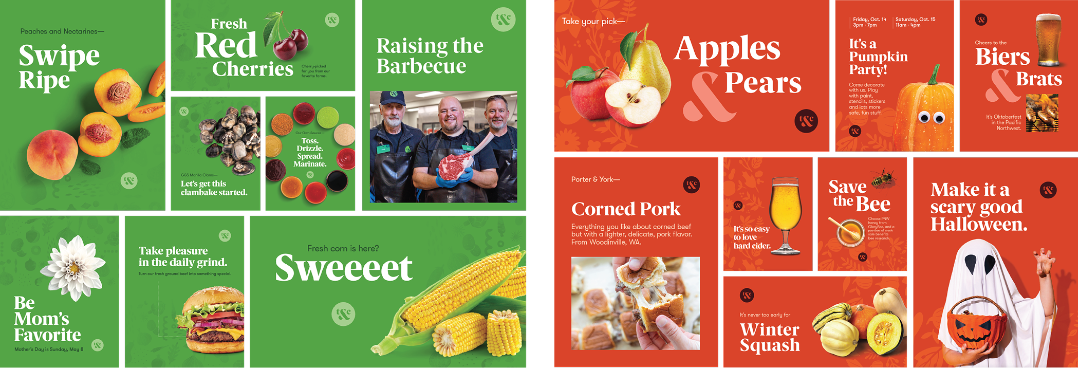
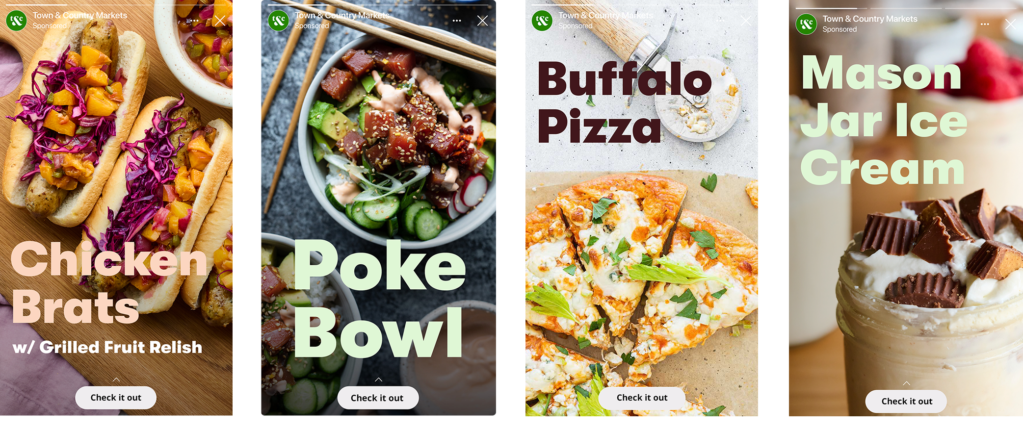
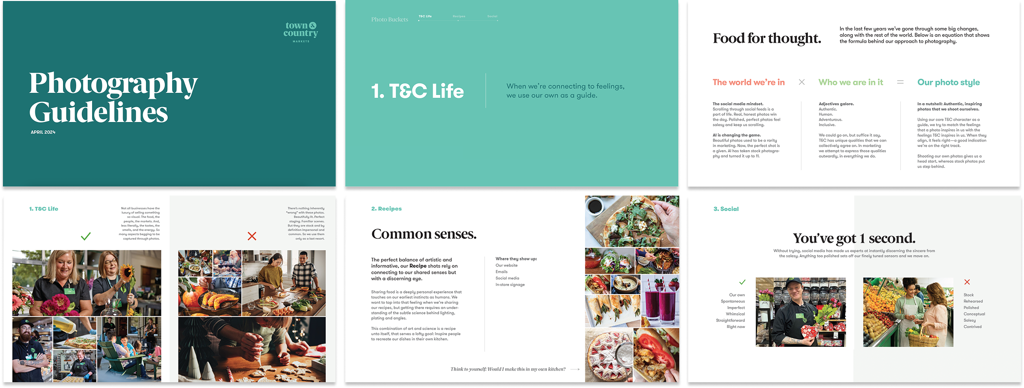
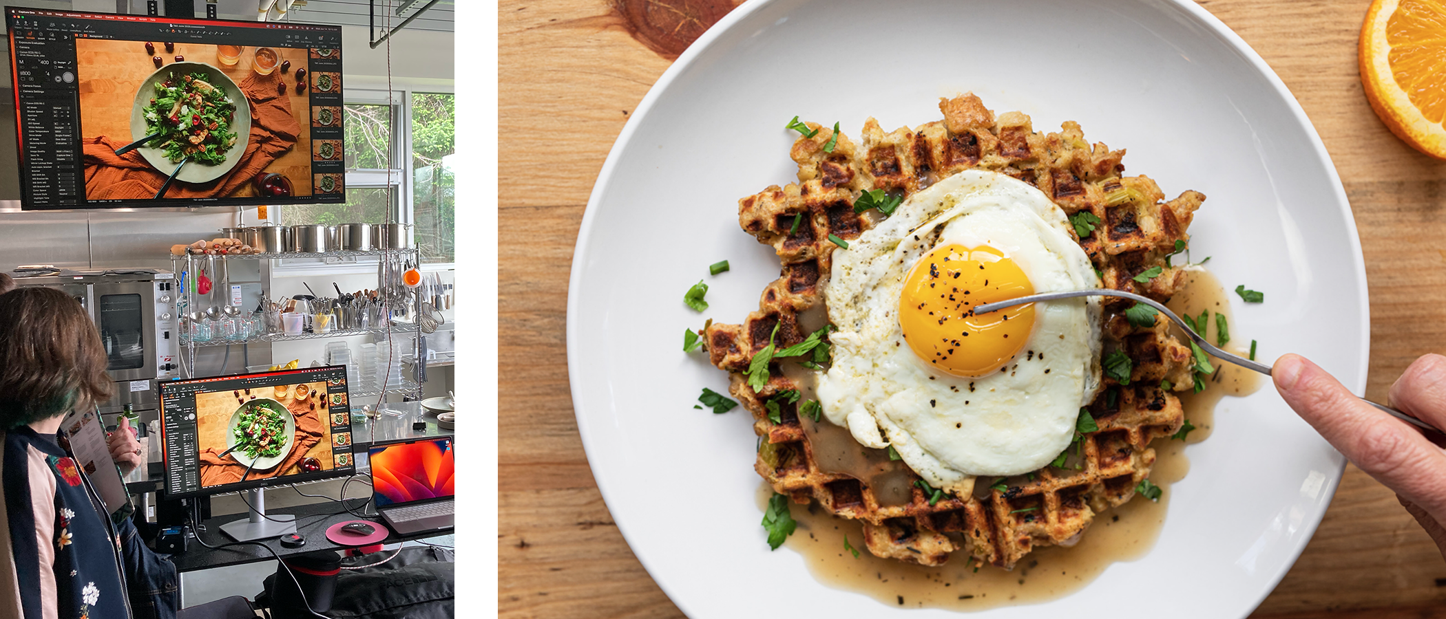
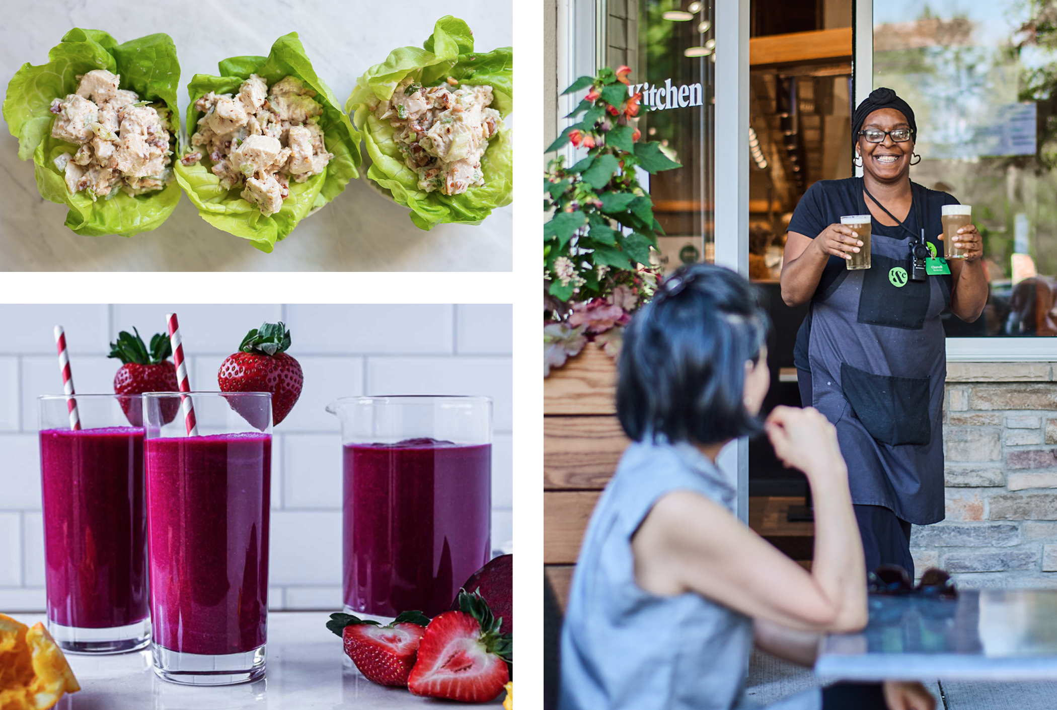
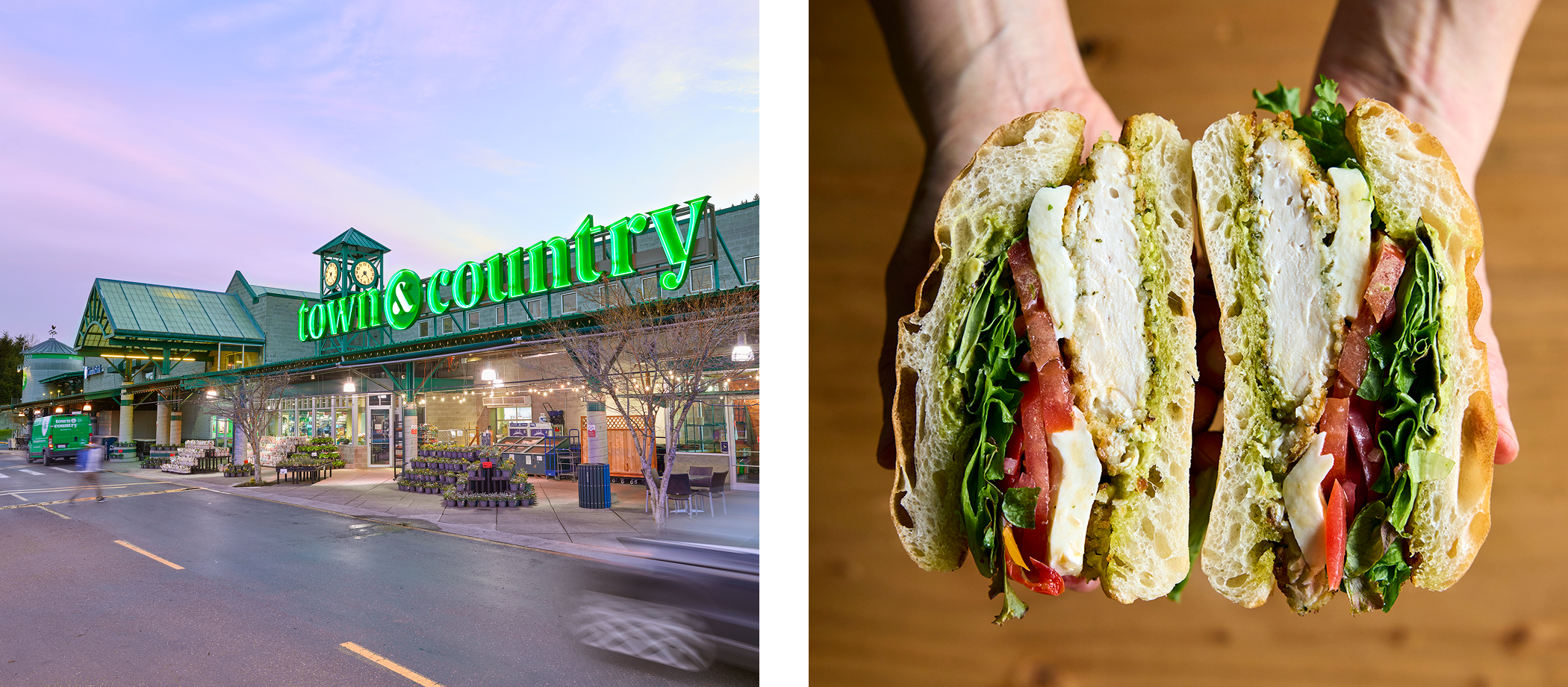
A new lens on photography.
Like the ingredients that go into a tasty dish, the ingredients that make up a good photo have shared qualities that we can define. Covering three main areas – in-store, recipes, and social – I developed photography guidelines for the creative team to reference as we strived for the perfect shot. Over time, we developed a consistent, unique and repeatable look.


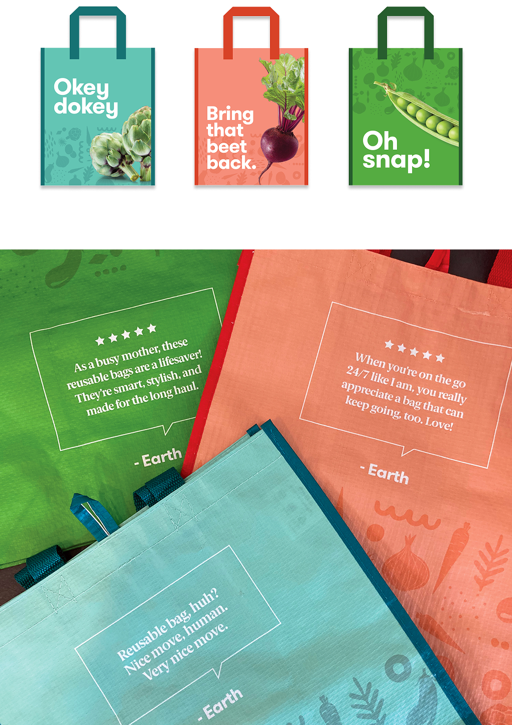
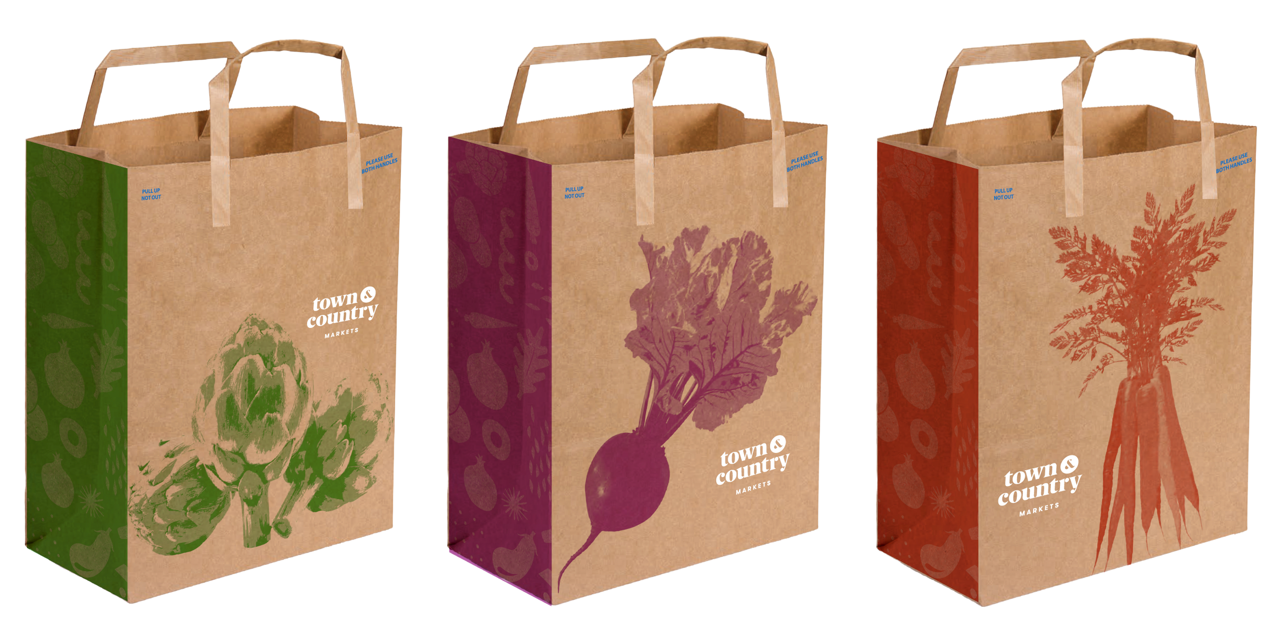
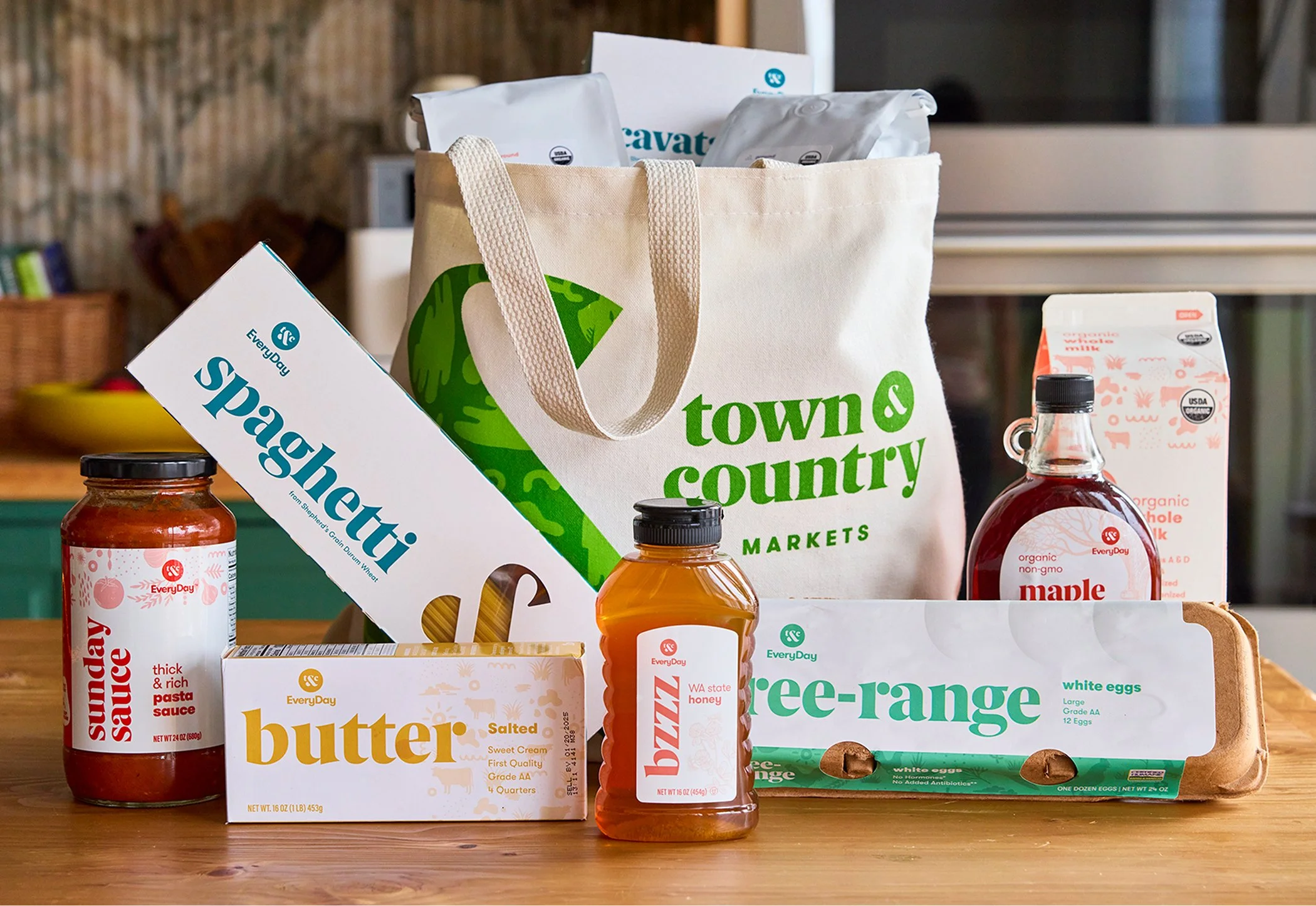
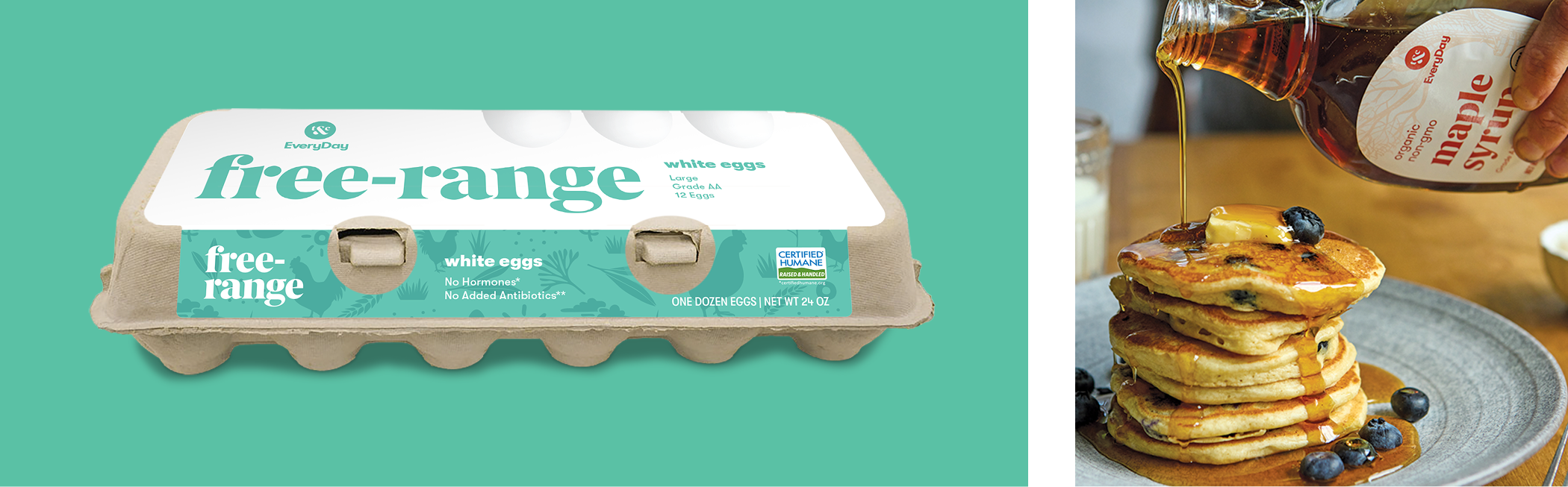
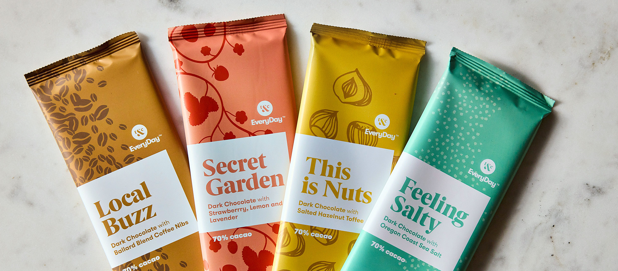
Not your everyday private label.
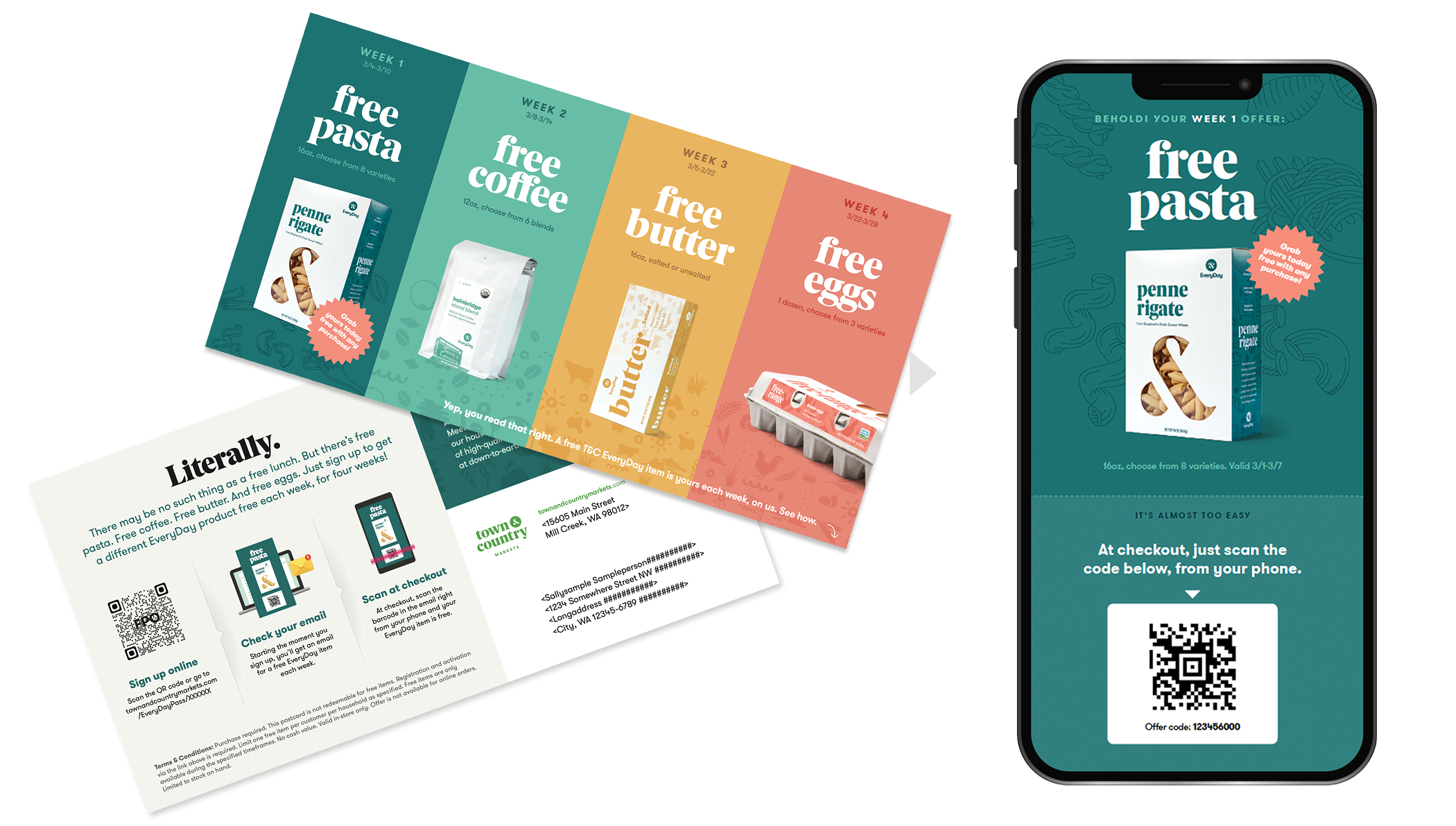
With the new brand established, we launched a line of private label products. After choosing a name, we built a brand memorable enough to be spotted on shelves but flexible enough to work across a wide range of products. Packaging featured employee art, poetry, and recipes. An aggressive giveaway campaign with mailers and digital coupons spread the word.


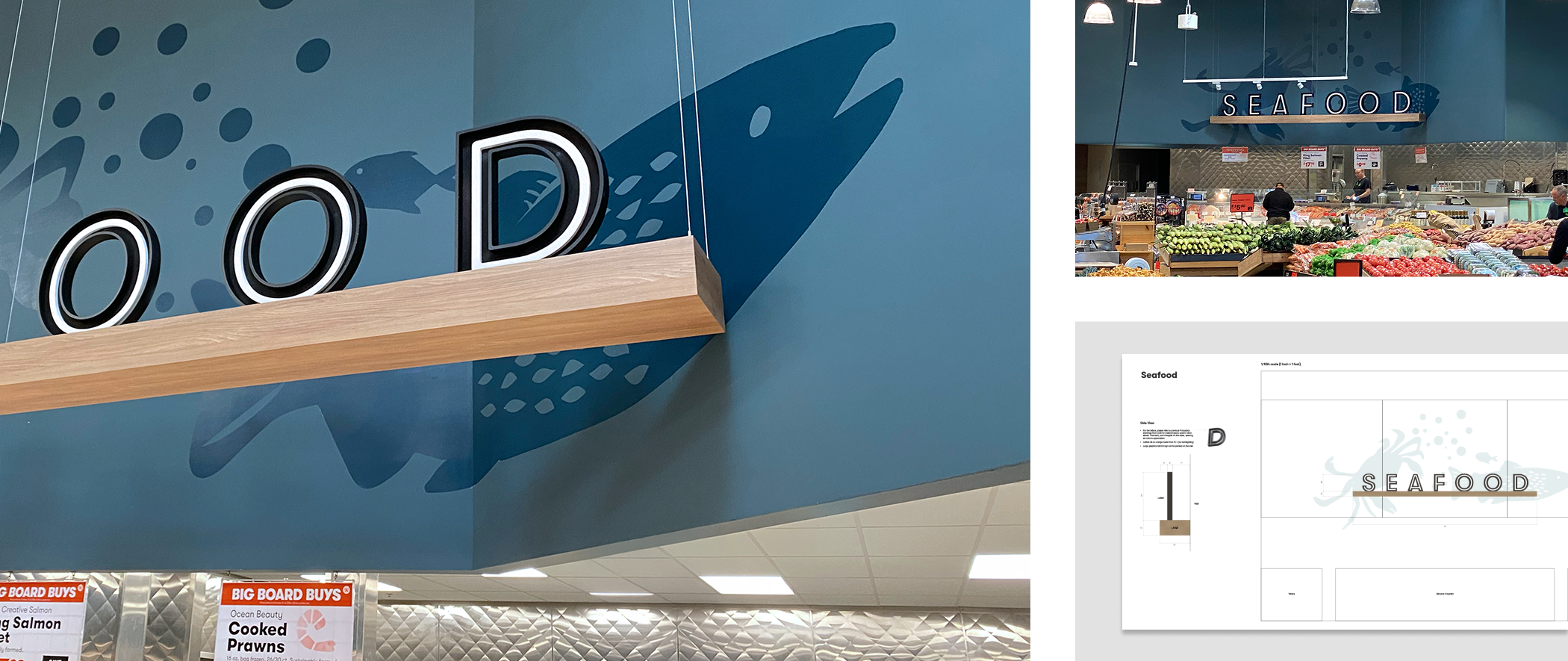
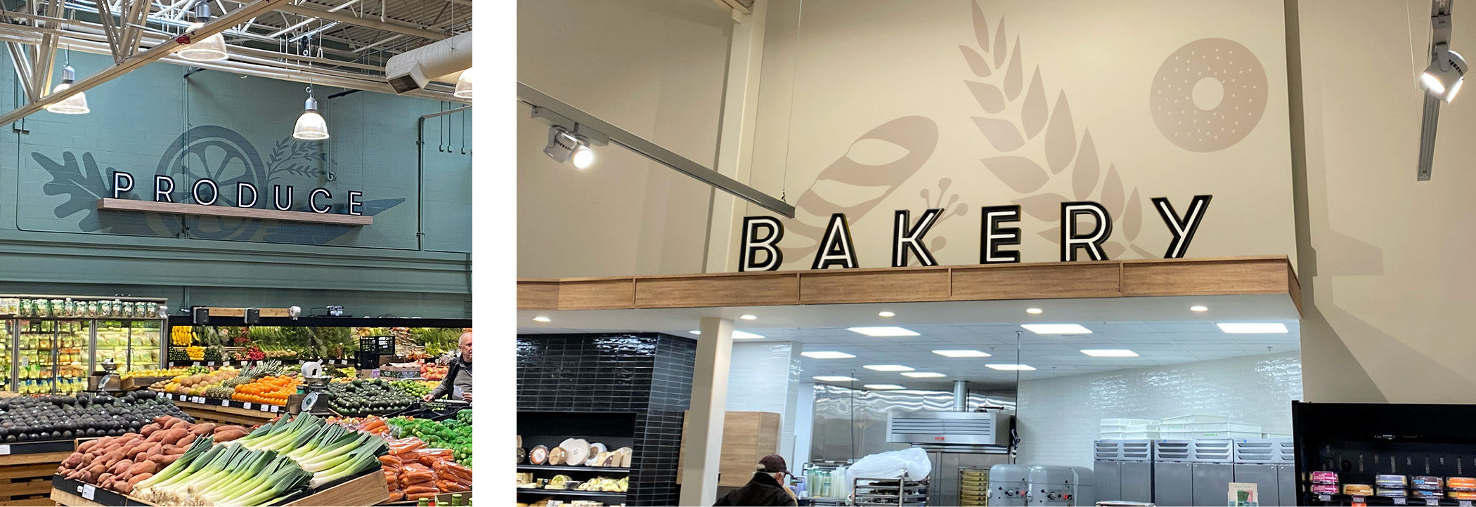
Less hunting. More gathering.
From department marquees to price tags, we overhauled wayfinding across the markets. Using consistent signage and reducing noise, we created a visual language that was easy to use for seasoned guest and newbie alike. In addition to being less frustrating for guests and easier on employees, it also resulted in more items per basket – a key metric for any market.

Everything from soup to nuts.
The sheer breadth of assets in a grocery store can seem overwhelming unless you have a plan. With the help of spreadsheets and Gantt charts, we picked these off one-by-one between larger initiatives. Being nimble, iterating on tight timelines, and staying true to the brand were our guiding principles.